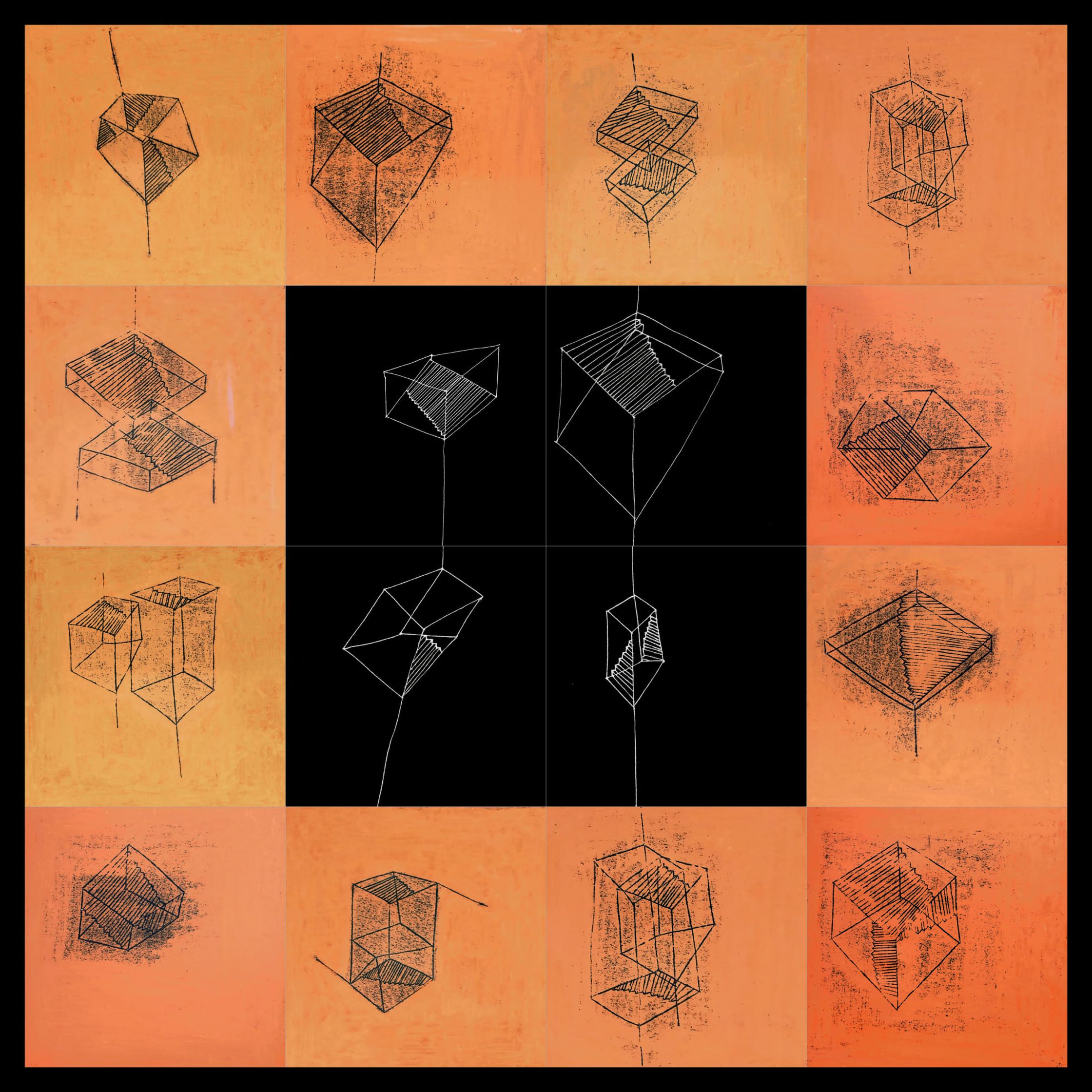
Earlier artwork
For the limited use of colour there is a simple and practical reason. I am spontaneous and use the material I carry with me, often just charcoal and pastels. As my mind never stops it is good for me not to have too many options, otherwise I lose myself. I do like black, not an easy colour. It contains all colours, and they may be wonderfully reduced with black. Or used in extreme opposites, as I previously did in my project CityNoCity, contrasting geometry with the lively images of the series Clouds and Cloudburst. Of the many colours I have used before, black was the only one which gave me satisfaction.
But commencing the Japanese House-project, out of curiosity I bought red and blue ink. I started illustrating on handmade paper and realised how Japanese coloured ink has the same qualities that so fascinated me in black.
